



Digital Business Card Examples That Make an Impression
Real digital business card examples by role and industry—founder, sales, creative, real estate, hospitality. What to include, how to lay it out, which links to lead with, and the one call to action each profile should own.
By VIPKART · Published June 20, 2026 · 8 min read
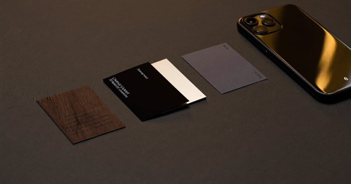
The fastest way to understand what a good digital card looks like is to stop reading about features and start looking at finished profiles. A founder's card and a hospitality card should not look the same, because the job they do is not the same. One is trying to make a memorable first impression that survives a busy week of meetings; the other is trying to turn a satisfied guest into a public review before they have left the table.
This is a tour of digital business card examples organised by who is using them. For each one you will see what belongs on the profile, how to order it, which link deserves the top spot, and the single action the card should push someone toward. The point is not to copy any of these line for line—it is to recognise the thinking behind a card that works, so yours does the same job for your own role.
If you are still deciding whether you need one of these at all, what a digital business card is covers the basics. This piece assumes you are sold on the idea and now want to see it done well.
The anatomy every good profile shares
Before splitting by role, it helps to name the parts. Almost every effective digital card is built from the same handful of blocks, arranged differently depending on the goal.
There is the header: your name, a clear photo or logo, your title, and the company you represent. There is the primary action, the one button you most want tapped—save contact, book a call, leave a review, open a portfolio. There are contact links: phone, email, the relevant social or professional profiles, a website. And there is proof or context: a short bio, a few selected projects, a testimonial, an address with a map.
What separates an amateur card from a sharp one is restraint and order. The weak version dumps fourteen links in a grey list and hopes the visitor sorts it out. The strong version decides what the single most valuable next step is and makes that obvious, then lets everything else sit quietly below it. Every example here is really a lesson in that one discipline: choose the priority, design around it.
Example 1: The founder
A founder hands their card to investors, partners, journalists, and potential hires. The card is doing reputation work as much as contact work. The visitor should come away thinking this person is serious and easy to deal with.
Header: A real photograph rather than a logo, because at this level people are backing the person. Name, the word "Founder," and the company. If the company has a recognisable mark, a small version sits beside the name without competing with the face.
Primary action: Save to contacts. A founder's goal is to be reachable later, not to push a sale in the moment. The vCard save is the whole point—it lands their number, email, and company in the other person's phone in one tap, spelled correctly, with no retyping. (If you have never set this up, how to create a digital business card walks through it.)
Below that: A two-line bio that says what the company does and what stage it is at. Then a link to the company site, a LinkedIn profile, and—if relevant—a calendar link for serious enquiries. Nothing else. A founder's card should feel uncluttered; the restraint signals confidence.
What to leave off: Personal social accounts, a wall of press logos, anything that reads as trying too hard. One strong proof point beats five weak ones.
Example 2: The salesperson
Sales is the role digital cards were arguably invented for, because the whole job is volume of clean follow-ups. A salesperson taps dozens of phones a week, and every fumbled contact is a lost thread. Here the card is a conversion tool, and analytics matter as much as layout.
Header: Photo, name, title, company. Warmth matters—people buy from people—so the photo should be approachable, not a stiff corporate headshot.
Primary action: Save contact, immediately followed by a Book a meeting link. The order is deliberate: get into the phone first so you are findable, then offer the path to the next conversation. A calendar link on the card removes the email tennis that kills momentum after a good first meeting.
Below that: Direct phone, email, and the one social channel where the salesperson is actually active. A short line of credibility—territory, specialism, or a notable client type—helps the prospect place them.
The detail that matters: A salesperson should be able to see which taps led somewhere. A card with built-in analytics tells you which event or which day produced engagement, so follow-up effort goes where the interest is. That is also why getting the follow-up itself right is worth its own playbook—networking follow-up covers what to send and when once the contact is saved.
Example 3: The creative
For a designer, photographer, illustrator, or any maker, the work is the pitch. The card's job is to get someone looking at the portfolio in seconds, before the moment passes. Text takes a back seat; the visual does the selling.
Header: This is the one case where a logo or a strong piece of personal branding can lead instead of a face—though a small photo still helps people remember who they met. The header should feel designed, because an undesigned card from a designer is its own bad signal.
Primary action: View portfolio. Everything funnels to the work. The link should open something fast and visual—a clean gallery, an Instagram feed, a Behance or personal site—not a slow PDF.
Below that: A one-line description of what they make and who they make it for. Then the platforms where the work lives, in order of strength. Contact details come last, because a creative usually wants to be discovered through the work first and contacted second.
The trap to avoid: Treating the card like a CV. Nobody hires a creative off a list of skills; they hire off seeing something they like. Lead with the work, keep the words few.
Example 4: The real estate agent
A property agent works face to face all day—open houses, viewings, signings—and meets people who decide quickly whether to trust them. The card needs to build that trust fast and make the agent effortless to reach about a listing. We go deeper into this in digital business cards for real estate, but here is the shape of a strong one.
Header: Photo (essential—real estate is a relationship business), name, "Real Estate Agent," and the agency. The agency logo reassures; the face does the trust work.
Primary action: Save contact with a prominent Call option. When someone is standing in a property they like, the friction between "I'm interested" and reaching the agent should be a single tap.
Below that: Direct mobile, a link to current listings, and the office address with a map so a buyer can find the branch. A short line of proof—years in the area, a neighbourhood specialism—does a lot here, because local knowledge is what buyers and sellers actually pay for.
Industry-specific touch: Many agents add a link to a valuation form or a "register your interest" page, turning a casual tap at an open house into a captured lead rather than a forgotten conversation.
Example 5: Hospitality and front-of-house
Restaurants, cafés, salons, hotels—anywhere a guest has an experience and then leaves—use a different kind of card entirely. The goal is rarely "save my contact." It is to capture feedback and public reputation while the goodwill is fresh, usually as a Google review.
Header: Often the venue's logo rather than a person, because the brand is what the guest is rating. Clean, recognisable, on-brand.
Primary action: Leave a review. One tap should open the Google review screen with the venue already selected—no searching, no friction. This is a fundamentally different card from the others, and it is worth understanding on its own terms: what a Google review NFC card is explains the mechanism.
Below that: Far less than a personal card. Maybe a link to the menu, a booking page, or the venue's social account. The whole design is built to remove every excuse not to leave the review—because the review is the entire return on the card.
Where it lives: Unlike a personal card you carry, a hospitality card sits on the table, at the counter, or by the till. The Google review card is designed for exactly this—a fixed point a guest taps on the way out, when they are happiest and most likely to say something kind in public.
Reading the pattern across all five
Look back at the five and the same principle runs through every one: the card is shaped by the single most valuable next step. The founder wants to be saved and remembered. The salesperson wants a meeting booked. The creative wants the work seen. The agent wants a call about a property. The venue wants a review.
Once you know your one action, every other decision gets easier. The primary button is the action. The header builds whatever trust that action needs. The supporting links are only the ones that move someone toward it. Everything that does not serve the goal is clutter, and clutter is what makes a digital card feel as forgettable as the paper one it replaced.
This is also why a card that tries to do everything does nothing well. If your profile pushes save-contact and book-a-call and follow-on-Instagram and leave-a-review with equal weight, the visitor's attention splits and they often do none of it. Pick the priority. Let the rest support it.
Building your own from these examples
You do not need a designer to apply any of this. A good platform gives you the blocks—header, primary action, links, bio—and lets you order and toggle them. The work is editorial, not technical: deciding what matters most and being willing to leave things off.
A few practical notes that hold across every role. Use a real photo unless you have a genuine reason not to; faces are remembered, logos are not. Keep your bio to one or two lines that a stranger can read in the time it takes to glance down. Put your most valuable link at the top and resist the urge to add a tenth link "just in case." And make sure whatever you build works the moment you tap it in front of someone—how to share your digital business card covers getting that first tap right, including the QR fallback for phones that cannot read NFC.
The cards that make an impression are not the ones with the most features. They are the ones where the person on the receiving end knew exactly what to do next, and doing it took one tap.
Frequently asked questions
What should a digital business card include?
At minimum: your name, a clear photo or logo, your title and company, and one obvious primary action—usually "save contact." Beyond that, add only the links that serve your goal: a phone number, the most relevant social or professional profile, a website, and, where it fits, a booking or review link. The mistake is adding too much; a focused card outperforms a crowded one every time.
How many links should be on a digital card?
Fewer than you think. One primary action and three to five supporting links is plenty for most roles. Each extra link dilutes the others and makes the visitor work harder to find the thing you actually want them to do. If a link does not move someone toward your main goal, it is probably making your card worse.
Should I use a photo or a logo on my card?
For personal cards—founders, salespeople, agents—use a photo. People remember faces and buy from people. For venues and brand-led hospitality cards, a logo usually makes more sense because the guest is rating the place, not a person. Creatives can lead with branding but should still include a small photo so people remember who they met.
Can one card serve more than one purpose?
It can hold multiple links, but it should still lead with one priority. A card that pushes four actions equally tends to get none of them done. If you genuinely need two very different goals—say networking and collecting reviews—it is cleaner to use two cards built for those jobs than to compromise one profile.
Do these examples work for teams, not just individuals?
Yes. The same role-based thinking scales across a company—a sales team, an agency, a chain of venues—with each person's card following the right template while sharing branding. Digital business cards for teams covers how to keep profiles consistent and centrally managed as you grow.
The best way to find your own version of these is to start building. Pick your one priority, choose the matching example as a starting point, and shape the rest around it. When you are ready to make one that taps cleanly and looks like it belongs to a professional, the VIPKART digital business card gives you the blocks—you bring the editorial judgement.
Ready to make a card people keep?
Tap to share, save in seconds, and update your details for life.
Explore VIPKART